As expected, I went to check out MAC Give me Liberty of London collection at my Saks. I have no idea but the sales associates there was really nice every time I went...You would think MAC X Saks = Snobby squared plus scary makeup...
Anyway, when I first went there, I couldn't find the MAC x Liberty of London display on the counter, which at the time was full of Spring Color Forecast, that ice cream/macaron collection (evidently the name was not as catchy as the food)tabloid beauty etc.
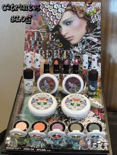 It turns out that it's placed on a desk right by the pillar (You know MAC releases too many limited edition when a Saks counter runs out space for them...)and while my main objective of going there was to convince myself I don't need those cheap and plastic-ky lipsticks...I still got suckered it and went "Day-yum, I want all of them..."
The lipstick/lip glass are very nicely made as the (lipstick)tube is even tougher than their standard edition ones and the floral print doesn't seem like it will get rubbed off easily. As of the products themselves, the whole collection seems a bit dull that beside the two coral lipstick/gloss : Ever Hip and Perennial High Style, everything else was very muted. (The sun was gone so my pictures turned purple again...)
 Petal & Peacocks - A magenta pink that would look good on girls with deeper/warmer skintone (as it's a bit harsh against mine), the color itself is not all that special, as I have a 2-dollar max factor that looks just like this. If you don't have a similar shade and want a magenta that glides nicely, this would be a nice choice.
Ever Hip - A sheer coral (I am not sure if I want to call this coral, since coral usually has more pink tinge) that feels like a soft balm and the only sunny color from the collection. This is the only cremesheen in the collection while the other three lipstick are amplified.
Peach shock Peachstock - Warm peachy nude. Very creamy, very poopy(some orange/peachy shades are really good at making my skin extra purple...)might look good on a California beach blonde babe...
Blooming Lovely - Muted lilac mauve, is it just me or that thing looks like bruise? It's quite creamy and pigmented and glides nicely (all MAC amplified cream do, right?) and I would say it could make a perfect nude lip for PPP (people from the purple planet) like me but with the touch of gray...I would get this if it weren't so pigmented.
 Not related to this collection: Some bright coral lipsticks comparison I did when I was checking out. (MAC impassioned on the left).
Enough with the lipsticks, the glosses from the collection was alright, nothing really stands out (beside the packaging) and the blusher/beauty powder don't look very unique, the one that looks unique would be the unwearable purple (How in the world are you supposed to pull that muddy purple off...on your face!?).
The two nail polish "Wite Out" and "Chicken Ticka Teal" (Rowena at Cosmetics Candy came up with the name, not for this collection though...do you know sometime I see mean/funny blog comments that I wish I come up with them myself...) looks pretty boring in real life, I would much prefer buying those (I only want one) nail polish from Orly Sweet collection which by the way is out in ULTA already and currently on sale at 5 bucks (instead of 7) not to mention they added a lot of stuff in thier clearance basket (get your 3.5dollar off coupon and head there if you have time).
Overall- A dull collection with very pretty packaging (usually that's all I need). I personally like the pattern on the lipstick and lip glass the best since there are more intricate flowers and the choked bird doesn't look that obnoxious when it's small.
P.S. I didn't even bother swatching those eyeshadow...
P.P.S. There is no makeup bag, pouch or the 95-dollar scarf in my counter. (Is it just me or it seems really diffcult to coordinate outfit with that thing?)
Anyway, when I first went there, I couldn't find the MAC x Liberty of London display on the counter, which at the time was full of Spring Color Forecast, that ice cream/macaron collection (evidently the name was not as catchy as the food)tabloid beauty etc.
It turns out that it's placed on a desk right by the pillar (You know MAC releases too many limited edition when a Saks counter runs out space for them...)and while my main objective of going there was to convince myself I don't need those cheap and plastic-ky lipsticks...I still got suckered it and went "Day-yum, I want all of them..."The lipstick/lip glass are very nicely made as the (lipstick)tube is even tougher than their standard edition ones and the floral print doesn't seem like it will get rubbed off easily. As of the products themselves, the whole collection seems a bit dull that beside the two coral lipstick/gloss : Ever Hip and Perennial High Style, everything else was very muted. (The sun was gone so my pictures turned purple again...)
 Petal & Peacocks - A magenta pink that would look good on girls with deeper/warmer skintone (as it's a bit harsh against mine), the color itself is not all that special, as I have a 2-dollar max factor that looks just like this. If you don't have a similar shade and want a magenta that glides nicely, this would be a nice choice.
Ever Hip - A sheer coral (I am not sure if I want to call this coral, since coral usually has more pink tinge) that feels like a soft balm and the only sunny color from the collection. This is the only cremesheen in the collection while the other three lipstick are amplified.
Blooming Lovely - Muted lilac mauve, is it just me or that thing looks like bruise? It's quite creamy and pigmented and glides nicely (all MAC amplified cream do, right?) and I would say it could make a perfect nude lip for PPP (people from the purple planet) like me but with the touch of gray...I would get this if it weren't so pigmented.
 Not related to this collection: Some bright coral lipsticks comparison I did when I was checking out. (MAC impassioned on the left).
Enough with the lipsticks, the glosses from the collection was alright, nothing really stands out (beside the packaging) and the blusher/beauty powder don't look very unique, the one that looks unique would be the unwearable purple (How in the world are you supposed to pull that muddy purple off...on your face!?).
The two nail polish "Wite Out" and "Chicken Ticka Teal" (Rowena at Cosmetics Candy came up with the name, not for this collection though...do you know sometime I see mean/funny blog comments that I wish I come up with them myself...) looks pretty boring in real life, I would much prefer buying those (I only want one) nail polish from Orly Sweet collection which by the way is out in ULTA already and currently on sale at 5 bucks (instead of 7) not to mention they added a lot of stuff in thier clearance basket (get your 3.5dollar off coupon and head there if you have time).
Overall- A dull collection with very pretty packaging (usually that's all I need). I personally like the pattern on the lipstick and lip glass the best since there are more intricate flowers and the choked bird doesn't look that obnoxious when it's small.
P.S. I didn't even bother swatching those eyeshadow...
P.P.S. There is no makeup bag, pouch or the 95-dollar scarf in my counter. (Is it just me or it seems really diffcult to coordinate outfit with that thing?)
I do love that insane-bird-packaging. I think I probably need it.
ReplyDeleteHi citrinee! how are you? I was too busy working hard past days but now i got some time... Well, do you believe that i don't like this collection? Those birds and flowers, i don't know, SO out. It looks like stuff people here in brazil use to celebrate the carnival.
ReplyDeleteI agree with you about this collection. The packaging is beautiful but the shades are dull, boring and not unique so I'm just gonna skip this collecion entirely.
ReplyDeleteEverything looks pretty boring... I'm just glad all the MAC powders/blushes/foundations break me out easily, which saved me wads of cash.
ReplyDeleteCome to think of it, I might get that ever hip lipstick, since I'll be skipping the entire To The Beach collection because those green/orange packaging are fugly. lol
i wonder if blooming lovely is the same as revlon's berry haute? Kind of looks the same to me.
ReplyDeletePixie:
ReplyDeleteI think most people who went and get this collection are just for the heck of packaging...
------------------------------------------------------------------------------------------------
Cacau:
Oh, things are fine over here (beside I got a little annoyed by certain things but that has nothing to do with you guys...)
That actually sounds kind of cool (the Carnival thing), I mean Cantonese like us think the OPI Hong Kong collection was stupid as hell but a lot of westerners would just fall for that marketing strategy... Like how I would fall for Liberty of London because it's sort of a novelty to me.
------------------------------------------------------------------------------------------------
Gio:
Sometime I wish they put their permanent lipstick in that packaging because the shades from this collection are quite dull (Makebe Liberty of London the brand is dull...but then again some very muted colors tend to look very good as nail polish but when you put that on the face...
------------------------------------------------------------------------------------------------
DP soap:
The packaging is a bit silly (if they try a little harder I might get a lipstick just for the heck of it) but I have to admit that seahorse powder/blush looks really cool though (I personally don't like to get pretty packaging that get deflowered right away...)
------------------------------------------------------------------------------------------------
Shellsea:
Yes, the two are very similar (in a sense that they belongs to the same family)but Berry Haute is deeper, more pink based (instead of purple based)looks more natural (like human internal organs.lol) while Blooming Lovely is lighter/more pastel, more lilac and dirtier (with that touch of gray)...Texture wise, MAC glide and adhere to skin a lot better than Revlon in a sense that even the color is a bit "strange for lips" the finish it has would help it look more natural.It's hard to say which is prettier or more wearable but it would be pretty nice if mac takes revlon berry haute and incorporate their formula on it. (Not that I will shell out 14 bucks for it, since I got my Revlon for 3 bucks.)
Anyway, for what I have seen, I have yet to see a drugstore lipstick with that kind of more expensive, second-skin texture...
I finally succumbed to my inner voice and bought the ever hip lipstick. lol I must say the packaging is gorgeous and the color looks pretty nice on my super pigmented lips!
ReplyDeleteDP Soap:
ReplyDeleteOh, it's nice that the color shows up well on you! (I have yet to try mine because I want to take a picture of the tube before I use it...anyway, I love the packaging as it doesn't look bland against lunasol/YSL)
just to let you know, peach shock is actually called peachstock :)
ReplyDeleteEmily:
ReplyDeleteThanks! I have just changed it (in the description part).