As you can see, I changed my layout, the new one is still quite minimalist but there are a lot more spaces to house bigger pictures...Don't complain (but please tell me if there is some hidden fatal flaw in my plan)as you will get used to it before you know it. (All I need to do is to enlarge some of my old pictures which were cropped out by the tiny spaces.)
See, swatches look so much better when they are big!
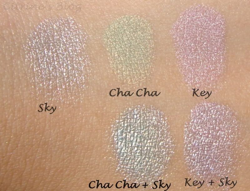
 Stila Mousse Pot eyeshadow in Sky (Silvery blue) layered on top of other stila eyeshadow. Do you know that shadow in gold, silver, blue are excellent layering pieces?
See, swatches look so much better when they are big!
 Stila Mousse Pot eyeshadow in Sky (Silvery blue) layered on top of other stila eyeshadow. Do you know that shadow in gold, silver, blue are excellent layering pieces?
I love bigger photos too...I played around with my layout when I started out (not long ago frankly) and was a lil frustrating...coz I wanted my photos to be bigger so details can be shown clearly. So I'm looking forward to clearer, bigger photos of swatches from ya now and onwards heheehehe :)
ReplyDeleteUnisan:
ReplyDeleteMy pictures are usually pretty huge (especially the very old ones because I was too lazy to resize)but you just have to click for them.
your new layout is definitely much simpler but you're right, the photos are huge and better :)
ReplyDeleteNikki:
ReplyDeletethis is actually exactly the same layout as my old one, just stretched...I have removed the linkwithin widget becuase it might be just to much pictures but I might add it back if I find a way to make it look cleaner.
I like this new layout! I want something like this, but am HTML illiterate...
ReplyDeleteI like the layout, it's very neat. And I like that the pictures are bigger now too.
ReplyDeleteDaituf:
ReplyDeleteIt's the one of the blogger provided layout called 'minima', I changed it from normal one to stretched. I am html illiterate as well...
Gio:
I am glad you like it!