One thing unique about Japanese beauty market is how fresh blood is constantly being pumped into existed brands. For many lines (even the ones that was selling great in the market) would do a complete brand revamp with a whole new range of products, packaging and spokemodels. The changes often result an updated brand identity and a message that (hopefully) resonate better with the said brand's target customers(or have a totally different target demographic altogether).
Off the top of my head. Lavshuca ditched their dreamy, ornate and young-at-heart identity for a more generically cute and girly one (completed with much younger actress/ spokemodels that I do not care for. Seriously though, Honda Tsubasa can't act). We all know how that went as the brand had just been discontinued. Anna Sui kept changing their packaging on their whole line, getting uglier and more cheap-looking season by season (Remember back in my earliest blogging day how I was obsessed with the brand) so I am not sure what they are heading for, hopefully not a kick in the rear by Albion. SUQQU's revamp in 2010 was a highly successful one and the six eyeshadow quads released at the time are still the most talked-about (at least in the Chinese speaking world) items. Maquillage toned down on their edge and added a touch of youthfulness and femininity that helped them attract more young professionals.
Shiseido Integrate is one of the brands that went through a successful transition. Back in the days, the brand used to featured simple coated plastic packaging (that looks like metal but feels flimsy) and have a spokesperson none other than Angelina Jolie. I thought it was an all-around strange combo because among their target (people shop at that price range, Asian women from their late teen to mid-twenties), how many of them actually look forward to look like Angelina (an accomplished actress and a motherly figure)?
I supposed somebody in Integrate marketing team finally realized the problem (or maybe the celebrity endorsement was too expensive)so the brand gradually rejuvenated itself. Currently, the brand has two spokemodels, round-faced cutie Kishimoto Cecil, who has been with Integrate for a while, and a newly employed Komatsu Nana. Exterior packaging hasn't changed much but the pan layouts have been getting playful and fancy.

I first became interested in Integrate Pure Big Eyes VI221 when I saw PJ at A Touch of Blusher added this into her favorites on the right side bar, next to Lunasol Lavender Coral. I enjoy Lavender Coral's in-your-face(and allover-your-face) sparkle, but I can take a little break from all the required clean up.
The current retail for Integrate palettes is around 15 bucks, since this shade can't be found in the usual Adambeauty, I had to deal with further markup on ebay. 20 wasn't too bad consider I ended up really like its performance.
Off the top of my head. Lavshuca ditched their dreamy, ornate and young-at-heart identity for a more generically cute and girly one (completed with much younger actress/ spokemodels that I do not care for. Seriously though, Honda Tsubasa can't act). We all know how that went as the brand had just been discontinued. Anna Sui kept changing their packaging on their whole line, getting uglier and more cheap-looking season by season (Remember back in my earliest blogging day how I was obsessed with the brand) so I am not sure what they are heading for, hopefully not a kick in the rear by Albion. SUQQU's revamp in 2010 was a highly successful one and the six eyeshadow quads released at the time are still the most talked-about (at least in the Chinese speaking world) items. Maquillage toned down on their edge and added a touch of youthfulness and femininity that helped them attract more young professionals.
Shiseido Integrate is one of the brands that went through a successful transition. Back in the days, the brand used to featured simple coated plastic packaging (that looks like metal but feels flimsy) and have a spokesperson none other than Angelina Jolie. I thought it was an all-around strange combo because among their target (people shop at that price range, Asian women from their late teen to mid-twenties), how many of them actually look forward to look like Angelina (an accomplished actress and a motherly figure)?
I supposed somebody in Integrate marketing team finally realized the problem (or maybe the celebrity endorsement was too expensive)so the brand gradually rejuvenated itself. Currently, the brand has two spokemodels, round-faced cutie Kishimoto Cecil, who has been with Integrate for a while, and a newly employed Komatsu Nana. Exterior packaging hasn't changed much but the pan layouts have been getting playful and fancy.
I first became interested in Integrate Pure Big Eyes VI221 when I saw PJ at A Touch of Blusher added this into her favorites on the right side bar, next to Lunasol Lavender Coral. I enjoy Lavender Coral's in-your-face(and allover-your-face) sparkle, but I can take a little break from all the required clean up.
The current retail for Integrate palettes is around 15 bucks, since this shade can't be found in the usual Adambeauty, I had to deal with further markup on ebay. 20 wasn't too bad consider I ended up really like its performance.

The compact is painted plastic: highly scratch-prone, light weight and compact in size (in my little acrylic drawers, I can fit 14 of these drugstore palettes in each compartment!). Unlike other drugstore palettes, this one is also has coating inside, which functions as a perfectly serviceable mirror.

The Pure Big Eyes is another gradational palette with straight forward layout. From top going counterclockwise:
1. Pale pink (it got washed out in the pictures) pearly base/highlighter. It's actually a clear white base with very fine and clear pink sparkle (which gets more apparent as it's sheered out).

2. A warmer (almost peachy in the pan) lighter-medium pink that perfectly works as a lid shade on its own. The shimmers is finer (than the allover-base pink) and the finish is more of a satin-pearl. I particularly enjoy the warmth in tone because how my own skintone would make things more pinkish/mauve. This just balances out to look neutral pink.
3. Medium lilac - this lid shade number two is tighty packed, shows up thinly (you don't get a thick powdery layer with each swipe) and is rather pigmented and true-to-color (unlike many lilac it doesn't turn ashy on the lid as it's blended, nor it gets too pastel.)

4. Matte plum with hidden sparkle. It's a defining eyeliner shade that is concentrated and easy to diffuse (As you know, I can't handle liner that are too intense)
5. White sparkle top wash - Clear that flashes multi-color and gives a wet sheen.

Here you get a well-cordinated palette that ensures even use. I just always get frustrated seeing eyeliner taking a huge space when I only dab a little each time (for others they can use it on crease I guess). As for sparkle top wash, I don't mind them yet as I can always pair them with singles.

On the eyes, Integrate evoke a very similar feeling as Lavender Coral. They are both fresh looking with the wet sheen. Integrate has a much more refined texture and a clean application! No glitters on brow.

To show the sheen. I did use the darkest liner shade, I just always blend the heck out of it every time. This might look sheerer than the Lunasol eye ball of the day (because for that one I ended up cheated with a L'Oreal infallible).
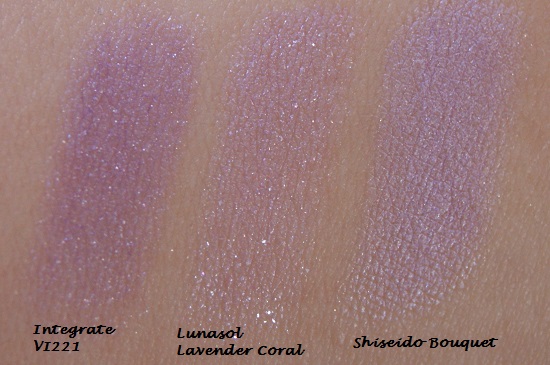
Lastly, quick comparison of the two. Integrate VI 221 appears deeper with small sparkle (there are the pink base and another pink lid shade to soften it up). The wet sheen from Lavender Coral come from the sparkle flecks from the pink and lilac lid shades (which explains why the fly out is so crazy) while in Integrate, the sheen comes from the top wash.

For the liner, Integrate is deeper, more condensed (so I don't over blend and make things muddy)contain less floating sparkle. While I wasn't hunting for dupes when I buy palettes, this certainly hit the same sweet spot for me. You can probably guess what my preferred child is.
Overall: A palette with carefully coordinated color and great quality. Need to look more into the brand(already did, got two more palettes).
Agree. Like this whole line of Pure Big Eyes as well as although the past few LE's have been kind of bland...
ReplyDeleteLuckily the LE are too bright so I don't want to hunt them down with mare up. I am thinking about the green one though, not sure how warm sheer sage would look now my skin gets ashier when it's cold (so lunasol pink beige doesn't look as flattering as it did in summer)....
ReplyDeleteThe pinks and purples are what drew me into this palette. So pretty! Thanks for the review & swatches. :)
ReplyDeleteYou should get it! It's hard to come by a lilac palette that's not dated, doesn't turn gray or isn't too pastel! So much better than the shiseido(although it is shiseido).
Delete