I have been flipping through some Japanese magazines lately and can't help but notice how orange (not the baked orange tan, more like a golden, juicy, ripe orange) cheeks are showing up everywhere...I am guessing it has something to do with Asia's trend called "Mori Girl"(forest girl) , where girls hug their bodies with warm-tone, comfortable clothing and (usually) peachy or orange cheeks. Maybe I am just paying more attention whenever it shows up now.
 I picked Paul & Joe face color/blush as I have been wanting to try their blush (with lovely packaging!) for a long time and Japanese blushers are usually sheer by nature thus less likely to go wrong, a perfect starter for colors like orange (now I wish they come up with some pale lilac blush like Majolica or Shu Uemura).
Harvest Moon - an golden orange with soft pink highlight (both shimmery) is one of the 3 shades from their fall 2010 Claire de Lune collection. While the orange is supposed to be the "blush" and the white as highlight,I usually just use it mixed since it's difficult (or maybe I just didn't even try) to pick up one color at a time with a fluffy blush.

The orange in the duo looks pretty much like the blush Rinka is sporting in this picture (one of the reason that I got into orange blush). Like what I have heard from other product reviews, the powder of Paul & Joe blush is extremely firmly packed and (nothing happen even if I drop it from a 4-foot height) creamy(if you use it, the dent is so smooth that it looks dome-shaped). The talc content (first in the ingredient list) make it smooth and silky as it go on but doesn't feel slippery finish.
Having looked through many online reviews and pictures, I knew I was going to get something subtly shimmery before I placed the order so it surprised me was that ...
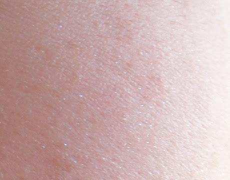
The shimmery shades of Paul & Joe give more of a matte, flush-like finish (instead of a glowy one)and the shimmer are actually like fine silver micro glitter, which gives a little bit of dimension (as it makes skin more see-through, not dimension of facial features) along with the flush. The orange looks rather natural (if I use too much it makes me look tipsy or sallow) and doesn't show much in the picture, but you can see how it's like compared to other coral/peachy blushes.
Overall: A very wearable shade with a silky finish. I am not as in love with the shade as I would like to be but I do appreciate how substantial the compact feels and weight (their lipstick tube feels a tad flimsy) while being compact and practical(love the decently-sized mirror!).
P.S. I think I noticed a faint floral/powdery scent the first few times I used it but after then, I didn't sniff anything. Maybe the smell is too faint and my nose is already used to that?
P.P.S. The orange/brown stuff on my cheeks are just spots (you really wouldn't be able to see the blush in the picture)...A friend somehow didn't want me to call those freckles because "freckles are supposed to be cute". When I asked her what are those then, "I don't know, acnes?" is what I got. To make her happy, I would just call those "age spots".
Very pretty shade!!!! I love how pigmented these blushes are but in a very natural way :D
ReplyDelete